FREE: Waterfall Chart in MS Excel
SKU:
A$0.00
per item
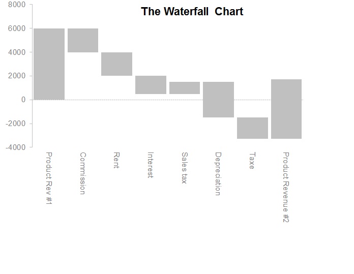
The waterfall chart is normally used for understanding how an initial value is affected by a series of intermediate positive or negative values. Usually the initial and the final values are represented by whole columns, while the intermediate values are denoted by floating columns. The columns are color-coded for distinguishing between positive and negative values. (source wikipedia)
It is very useful in doing power point presentations to show the effect of each area of the business and how it adds or subtracts to the bottom line, for example starting with product revenue from which you show the impact of taxes or commissions.
It is very useful in doing power point presentations to show the effect of each area of the business and how it adds or subtracts to the bottom line, for example starting with product revenue from which you show the impact of taxes or commissions.